

Furniture Fiesta Life & Culture
LIFE AND CULTURE SHOPPING TRENDS HOME TOURS DESIGN DECORATING
Learn the best color combinations for house interiors, from light hues to trendy palettes.
Designing your home’s interior can be one of the most exciting parts of homeownership. However, it’s also one of the most personal, as the colors you choose don’t just shape the look of your space—they influence how it feels to live there. Whether you're drawn to calming tones, bold statements, or something in between, the best color combination for house interior can transform your home into a reflection of your style and personality. This guide will help you navigate through ideas for creating a cohesive, beautiful space, whether you're selecting light color combinations for rooms or experimenting with trendy apartment color combinations.
Color selection begins with understanding the mood you want to create. Every color tells a story, so think about the role each room plays in your home. Warm colors, like reds, oranges, and yellows, bring energy and are perfect for gathering spaces like the living or dining room. Cool colors, such as blues, greens, and purples, are naturally calming, making them a great fit for bedrooms or quiet nooks. If you want to play it safe while staying timeless, neutral tones—like whites, beiges, and grays—are your best bet. They offer a clean, versatile backdrop that can adapt to any decor style.
But the psychology of color isn’t the only factor to consider. Lighting plays a huge role in how colors look. Natural sunlight shows off the truest version of a color, but it shifts throughout the day. Artificial lighting, on the other hand, can completely alter a shade’s appearance. Warm lighting enhances earthy tones, while cool lighting makes colors look sharper and more modern. A tried-and-true rule for balance is the 60-30-10 method. Use one main color (60%) to dominate the space, a secondary color (30%) to add contrast, and an accent color (10%) to bring in a pop of interest.

Trendy Light Color Combination for Room
Lighter colors are a favorite for their ability to make spaces feel bigger, brighter, and more inviting. A classic choice is combining white, soft gray, and baby blue for a serene, dreamy look—perfect for bedrooms or home offices. If you're leaning toward warmth, beige paired with cream and pastel pink creates a cozy, inviting atmosphere for your living room. In kitchens, fresh tones like mint green, pale yellow, and ivory work beautifully to create an uplifting space where you’ll want to spend time. Light colors have a way of maximizing brightness, making them ideal for smaller or darker rooms.
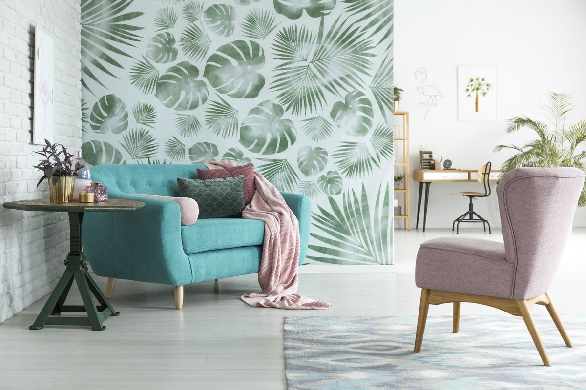
When it comes to smaller spaces like apartments, color selection can make or break the ambiance. Neutral beige paired with dusty rose and white is perfect for creating a soft, feminine aesthetic while keeping the space open and airy. For a modern twist, gray with charcoal and mustard yellow adds a sense of depth and sophistication without making the room feel heavy. If you’re inspired by nature, pale sage green, white, and wood tones offer a trendy biophilic palette that works wonders in compact urban homes. By carefully choosing colors, even a small apartment can feel expansive and full of character.
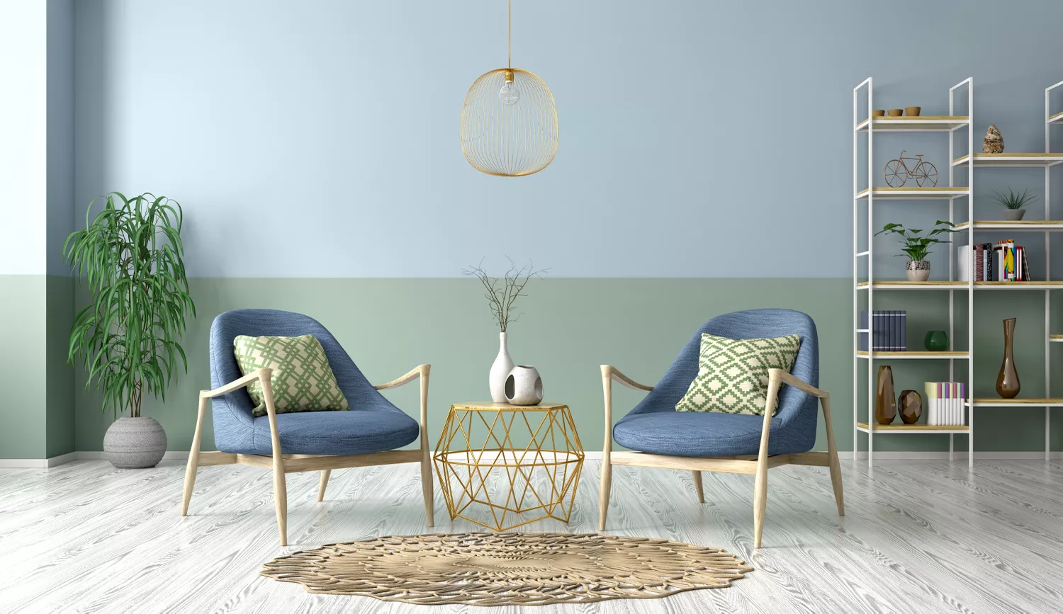
The right color combination can set the tone for each room in your home. In the living room, beige with white and gold accents offers timeless elegance, while gray paired with soft blue and black creates a sleek, minimalist aesthetic. For those who love bold and vibrant spaces, a mix of teal, coral, and ivory adds personality and energy.
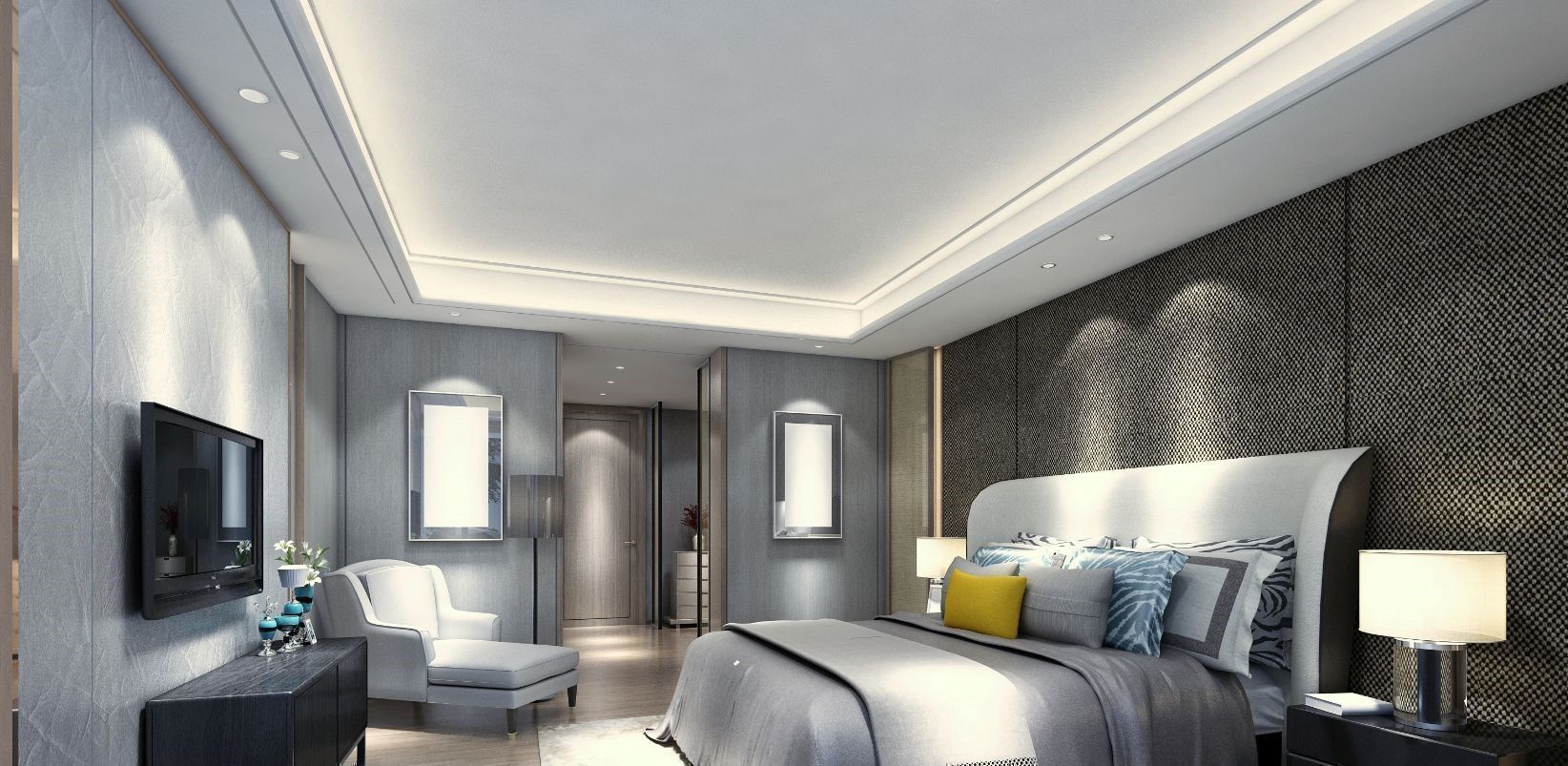
In bedrooms, calming hues are key. Lavender, light gray, and white create a peaceful retreat, while navy blue paired with beige and wooden accents brings warmth and sophistication. For a touch of luxury, pastel pink with soft white and gold offers a dreamy, feminine vibe.
Kitchens are where functionality meets style. A classic combination of white, mint green, and stainless steel gives a clean, modern look. If you’re a fan of rustic charm, try warm beige with wood tones and black accents. For something contemporary and sleek, charcoal gray paired with white and silver delivers a polished finish.
Hall Colour Combinations Photos Ocean Blue and Sage Green
Your hallway is the gateway to your home, so why not make it unforgettable? A soft peach combined with white and brass accents creates an elegant and welcoming feel. For a bolder statement, olive green with mustard yellow and gray is an unexpected yet stylish choice. If you prefer a more calming and coastal vibe, light aqua blue paired with white and warm wood tones offers a fresh and breezy aesthetic. As you browse hall colour combinations photos, pay attention to how textures and small decor elements, like mirrors or rugs, enhance the overall look. These finishing touches bring personality to your hallway while tying the colors together.
In recent years, earthy tones like terracotta, sage green, and soft blues have taken center stage. These natural shades bring a calming energy to any room and pair beautifully with wood and metallic finishes. Monochromatic palettes, which use varying shades of a single color, are also gaining popularity for their cohesive and modern appeal. Whether you want something bold or understated, these trends offer plenty of inspiration to make your home feel fresh and contemporary.

Indoor Color Combination for Modern Home
Choosing colors can feel overwhelming with so many options available. The key is to take it step by step. Start by testing paint samples directly on your walls and observe how they look at different times of the day. This will help you see how lighting affects the colors. If you’re worried about balancing multiple shades, stick to the 60-30-10 rule to ensure everything works harmoniously. Lastly, while it’s tempting to follow trends, it’s wise to choose neutral tones for larger surfaces like walls. This way, you can easily update your space with trendy accents or decor whenever you want a refresh.
Selecting the best colour combination for home interior is more than just a design decision—it’s about creating a home that reflects your personality, suits your lifestyle, and feels inviting. Whether you’re inspired by soft light color combinations for rooms, experimenting with bold indoor color combinations, or flipping through hall colour combinations photos for ideas, the possibilities are endless. Take your time, trust your instincts, and remember that the perfect palette is one that makes your house feel like home.
The first step should be to select a desired mood for each individual space. Users should combine lighting conditions with furniture arrangements alongside architectural features. Apply the 60-30-10 rule to select colors accurately and view paint swatches ahead of time before making the final color choice.
Your home's architecture type and surrounding area and personal taste should guide your color selection process. A facade constructed with neutral tones allows for maximum adaptability yet combat piece applications deliver distinct visual appeal. Check paint samples under various lighting situations so you can see how colors evolve during the day.
A balanced color scheme emerges when using the 60-30-10 design principle. The design principle requires walls to use a dominant color in its dominant role with furniture and upholstery receiving a secondary color ratio while decor along with artwork usage accounts for the smallest quantity as accents.
Your personal style alongside the dimensions of your space determine what color combinations work best. Safe permanent color options like beige and gray work for eternal design while earthy hues provide cozy sensations and delicate pastel shades create light airy spaces. Your space appearances can benefit from the integration of contrasting colors alongside complimentary colors tones.
1. Wardrobe Direction As Per Vastu: 10 Tips for Ensuring Positive Energy
2. Top 5 Simple Wall Painting Design Ideas to Refresh Your Space
3. Modern Cupboard Designs for Small Bedrooms
 (2).jpg)
Explore Bright Color Modern Bedroom Bed Back Wall Design, Cushioned Modern Bedroom Bed Back Wall Design, and Mirror Bed Back Desig...
Read Article
Explore Bright Color Modern Bedroom Bed Back Wall Design, Cushioned Modern Bedroom Bed Back Wall Design, and Mirror Bed Back Desig...
Read Article.jpg)
Explore Bright Color Modern Bedroom Bed Back Wall Design, Cushioned Modern Bedroom Bed Back Wall Design, and Mirror Bed Back Desig...
Read Article